Add Option to Arrange Result Details Result Actions Vertically or Wrap

I think it would be beneficial to allow an option to arrange the Result Actions that show up in the Result Details panel vertically. Currently they can only be shown in a horizontal list that is difficult to navigate if the option “Show Action Titles” is checked on.
We are targeting a wide audience for our VertiGIS Studio Web browser - as a result, using only icons for the Result Actions does not really give enough context at the start for what the Action does (even with hover tooltips).
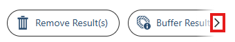
With “Show Action Titles” enabled, depending on the number of Result Actions, the actions display in a fading, horizontal list that is difficult to expand or navigate through.
I would love to see an option to just have the Result Actions show in a vertical list so that Action Titles can be displayed without becoming unwieldy.
-
Official comment

Correct, thank for sharing the changelog link Henry Haro. This feature is on our roadmap and can be tracked in the Changelog.
-

Adding to this, I think it would be useful to have an option where actions are horizontally arranged, but if there are too many to fit the visible area, they continue on the next line. So, there may be two shown on the first line, and three on the next for instance, depending on the amount of text. Thanks.
4 -

I have always thought this would be better - agree with these other options!
1 -

Related with a possible CSS workaround
Even if all buttons stay on a single row, I think it would be better UI to have a dropdown arrow, similar to Edge, which has a dropdown button in the top-left corner, where you can select from a list of all tabs
1 -
Thanks for the link, Berend. That Ideas post is covering the same need I referenced.
I found that this is being tracked as a Feature Added in the Product Change Logs, hopefully for a future inclusion. https://changelogs.vertigis.com/workitems?productLine=VertiGIS+Studio&id=344701
1
Please sign in to leave a comment.
Comments
5 comments