Result Details Actions Customization
I have many feature actions set on my result details pane. I would prefer to have labels on for ease of understanding. However, users cannot read all of the buttons when scrolling.
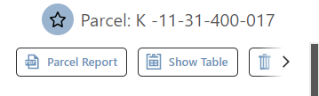
If I scroll over, you only see the 2nd half of the trash can button.
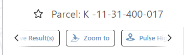
I see the same issue on the sample app, so I don't think I'm missing anything obvious.
Can you allow us more customization of this area? Perhaps leave a couple commonly used actions out as buttons and the rest behind a 3 dot menu?
-

It would be pretty nice to have the option of putting a drop-down list button in there that works kind of like IWT and the toolbar multibuttons.
2 -

I would like the actual TITLE of the action to display if it is set to ‘icon only', not the description, so I don't have to do things like this
just to make all the buttons fit so the above crowding doesn't happen…
2 -

Bump.
2 -

still don't see any options for this yet. I'd probably prefer the icons to just wrap to a new line so you can see everything
2 -

I agree with the unwieldy nature of Result Actions with the Action Titles/labels displayed.
I made a post in the VertiGIS Studio Web Ideas board here so that it hopefully gets on the team's radar.
1
Bitte melden Sie sich an, um einen Kommentar zu hinterlassen.
Kommentare
5 Kommentare