Map Tip Drop Down Selector Doesn't Resize to Content
During user acceptance testing there was an issue raised about the drop down in the map tips. It seems to be that the width of that drop down is based on the content in the MAP TIP and not the content in the DROP DOWN BOX. 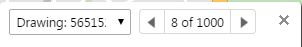
Below is an image showing where the content has been truncated because the map tip content is too small to make the box wider. Maybe it's fixed in the 2.6 viewer but can't confirm.
Would it be unreasonable to expect this to be fixed in the next release/patch?
GE 4.4
HTML5 Viewer 2.5.2
0
-

Thanks Matthew! I've passed this along to QA team to evaluate. 0 -
I've spoken with our design lead about the current behavior of map tips and whether it made sense to have the drop down resize dynamically. Here's his response:
The widths of the map tips are not based on the content of the map tip but rather on the width of the browser window.
The widths of the select boxes have to be limited in size to prevent the map tips from obscuring a large portion of the map when the values within the select box are very long. Changing the width of it based on the content of the options would also be problematic for the user if the map tip resizes while changing options (the close button would be jumping around and changing positions).
Even when the selected value is clipped in the select box and unreadable, it is repeated again directly below the select box as the heading for the map tip content. This was done specifically so we could show the full value that might be cut off in the select box. As a heading we have the ability to allow the long value wrap to multiple lines where in the select box we do not have the ability to wrap to more than one line.
Here's an example of a truncated select value repeated to display the full value: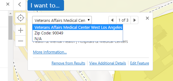
I hope that's helpful.0 -
Thanks Jordan, that is very helpful and will make sense to the users :)
The map tip mentioned in that^ screen shot of yours Jordan is not the type of map tip we are using. We are using the map tip which appears where the user clicks and it most certainly changes size based off the content. Additionally the behaviour where the close button and next buttons jump around is experienced with our setup.
To be precise out map tip configuration is that which is detailed on page 181 of the Administration and Developer Guide. It's titled Callout-Style Map Tips. Thinking it is important to highlight that the box jumps around a lot based on the content. It's annoying and we'd accepted it as intended functionality but if it's not then maybe life will be better soon.
Thanks for your attention :)0 -
Yes, sorry! My last post referred specifically to fixed map tips.
Callout map tips are much trickier. They're positioned relative to the feature (or features) they describe, so from the bottom-up, vertically, and center-out, horizontally. Managing to somehow keep a map tip's controls in a consistent location without negatively impacting another aspect of the UX would probably mean a significant revamp of that interface.
I've filed an improvement (GVH-10436) and talked to our design lead and one of our senior developers about potential solutions, but we couldn't come up with anything relatively simple and low-risk that we could potentially work into an upcoming release. Given the list of features we're committed to developing right now, it may be some time before we have a chance to properly re-evaluate callout map tips. If that changes, or if one of us is struck with sudden inspiration, I'll post an update.0
Du måste logga in om du vill lämna en kommentar.
Kommentarer
4 kommentarer