Line Chart for single feature point

Hi, 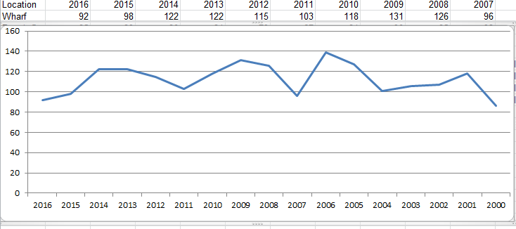
I am trying to replicate something in Geocortex that is very simple in Excel with the Charts function. I have a layer that shows an average yearly pollution level for each recording location.
In Goecortex I want to show a line (or scatter) chart like the one below that I really easily created in Excel. I am struggling to work out how to do this is Geocortex.
Using Essentials4.5.1 HTML Viewer 2.6.1
Thanks in advanced.
0
-

Halil,
I was able to create this type of chart with a spreadsheet linked by ODBC. The data has to be formatted for one-to-many access. Here is what I'm talking about. Note that for site 1001 there are values associated by year.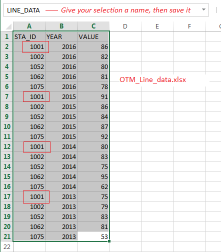
Now create a Data Connection to the spreadsheet:
Next step is to create a Data Link for your data layer using STA_ID for the Feature Field. The parameter name is just any name you create:
Then create a chart for that layer using VALUE for the field: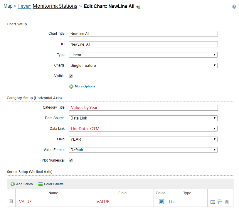
Let me know if you need further assitance.
Rick0 -
It's also possible to chart for multiple feature selections for stacked lines: 
Rick0 -
Hi Rick,
Thanks so much for your detailed reply.
I don't really want to use external spreadsheets, all my data is in a map service consumed in Geocortex and would like to keep it that way, formatted like the table I original posted from Excel, one feature with all the years recordings in different fields e.g. 2016,2015, 2014 etc. Sorry if I didn't explain that well in my original post.
I want my user to be able to click on a pollution recording point on the map and then see a graph with a time-series of average measurements over the last 16 years, just like the chart you show above. Do you think it is possible with my data formatted how it currently is?
Is the way you explain above the only way to do it?0 -
Halil,
The only way that I was able to create the chart as illustrated was to format the data as one-to-many, either with a spreadsheet or SQL table. Perhaps there is another way. Hopefully Geocortex staff can clarify.
Best Regards,
Rick0 -

Hi Halil,
Richard is correct, you will need to create a data link with a one-many relationship.
We recommend using linear charts when comparing multiple features. In your case, you are trying to use a linear chart for a single feature, I would suggest using data links to acomplish this.
If you require assistnace setting this up, please open up a support case and we would be happy to help!
Thanks,
Ali
0 -
Hi Richard,
How did you get the multiple features to chart as stacked lines?
Thank you,
Stephanie0 -
Still looking to show multiple features on one chart with stacked lines. Can anyone share how to do this? When I have multiple features selected the chart shows just one line with the aggrgated results (sum, average, etc.).
Thanks,
Stephanie0
Du måste logga in om du vill lämna en kommentar.
Kommentarer
7 kommentarer