Charting: X-axis setup does not display properly if Plot Numerical is enabled
I am trying to implement the profile tool that was provided in the LA County sample site and want to simplify the look of the chart to display only integer values on the x-axis but the axis becomes illegible and the vertical shading stops.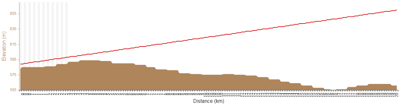
To make the x-axis display the way I want, I had to disable the Plot Numerical option, but that only gives me one elevation reading per kilometer and my sample size is 100.
I don't think the Plot Numerical option should be affecting the x-axis setup... Is there a way to workaround this?
0
-

Hi Sharon,
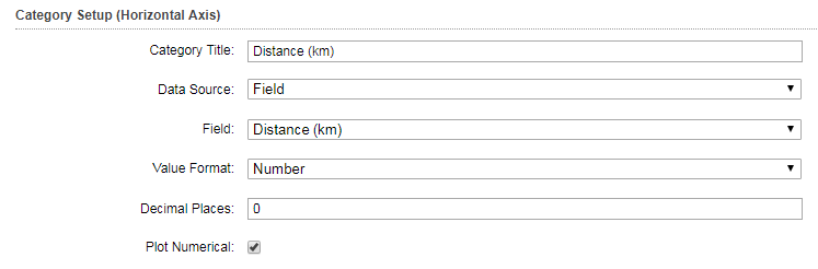
When running the profile tool from the LA County Sample site and want to make it more legible on the x-axis, I would recommend that you reduce the sample size to something like 20 or 30. This would reduce the crowding on the x-axis. You can do this by editing the "Profile Tool" workflow that is part of the LA County site and changing the "NumberOfSamples" in this configuration. If you need to use 100 samples, it will look cluttered.
On testing on my end, I did not get a difference in results whether I applied "plot numerical" or not. Are you applying this profile tool to your own DEM or to the one provided in the LA County site? And also, this profile tool makes use of the "Elevation Points" point layer in LA County too. Are you using that one, or using your own? If you are using your own, it will need to have exactly the same structure as the Elevation Points layer provided as the Profile Tool workflow depends on this.
I hope some of this answers your question.
Thanks,
Marion.0 -
Thank you for the reply, Marion.
I am using my own "Elevation Points" point layer which is configured like the one in the LA County site. I am also using a different DEM with a lower resolution (hence the stepped appearance). I will eventually switch to my own DEM so I am not too concerned about the difference in profile appearance in my examples.
I tested my chart settings in the LA County site and got the same results as you. I think the reason why turning off "Plot Numerical" looks different on my site/data is because I am using Distance in kilometers instead of meters. I guess I was unsure as to how "Plot Numerical" affected the chart.
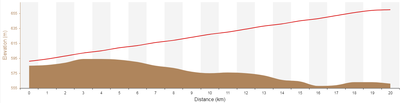
Anyway, I would like to use a sample size of 100 and not have a cluttered x-axis... Or have the ability to customize the labelling on the axis. For example, in the profile below taken from the LA County site, I might want to label the x-axis every 100m.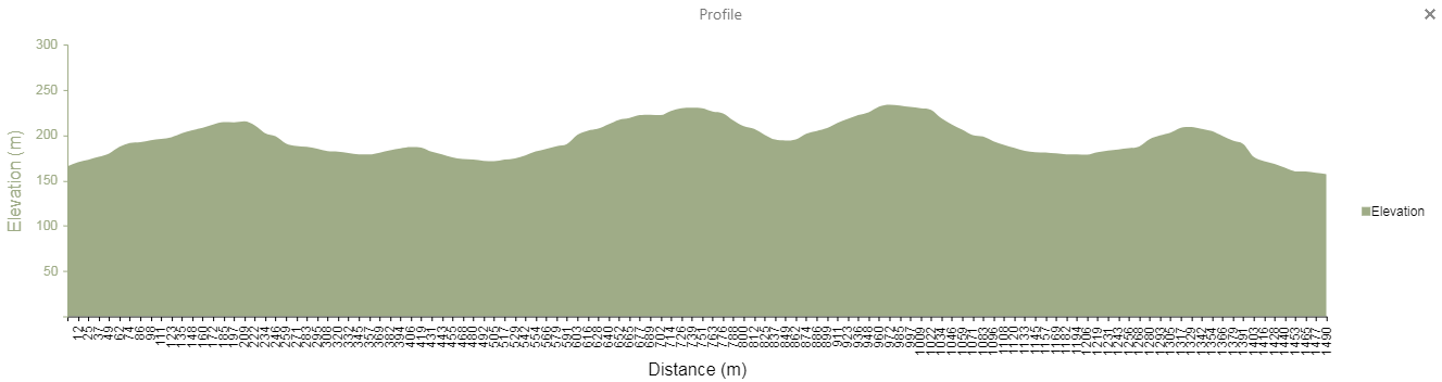
Thanks,
Sharon0 -
Here's a recap in case anyone else encounters this:
In Html5Viewer 2.10.0, the number of labels on the horizontal axis corresponds to the sample size so when you have a large sample size, labels will appear very crowded and illegible.
The recommendations from support are:
1) Upgrade to 2.10.1 and Essentials 4.9.1 and enable Smart Labels, which are disabled by default. The Smart Labels option is found in the More Options panel from the Chart Setup (Edit Chart) page.
2) Turn off labels and/or ticks to remove them completely. Values are still available by using the mouse and hovering over values on the chart.
3) Use the scroll wheel to zoom in on regions of the chart to see the labels.0
Du måste logga in om du vill lämna en kommentar.
Kommentarer
3 kommentarer