How can I set the labels and colors of a pie chart
Hi,
I'm building a report for an existing site. The site Includes a workflow that shows the energy label composition of the buildings in a selected neighbourhood.
The Energy labels range from A++ to G and are stored in a single attribute of a arcgis feature layer. The buildings are related to the neighbourhood layer through a shared key.
I configured a piechart with a single series using a count data aggregator on the energy labels. The graph which I configured in essentials manager is shown on the left and my result so far in reporting is shown on the right.
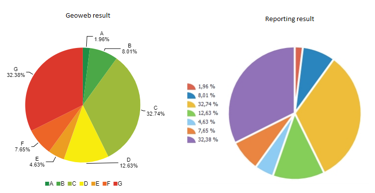
I configured a single series graph without to much effort in the manager and want to add a similar graph to the final report but run into two problems. First I am unable to set the labels/legend of the pie slices to their respective energy labels instead of the default percentages. Secondly, I would like to use custom colors for each slice in the piechart so I can use similar colors to the graph in the site.
I looked in the reporting documentation but could not find any help regarding the graphing tool. Any help or suggestions would be greatly appreciated.
Regards,
Gersom
-

I solved my problem after I got a response from Ryan Cooney from Latitude Geographics, posting it here for reference...
To format the labels on the chart area you do this:

To format the labels on the legend you do this:
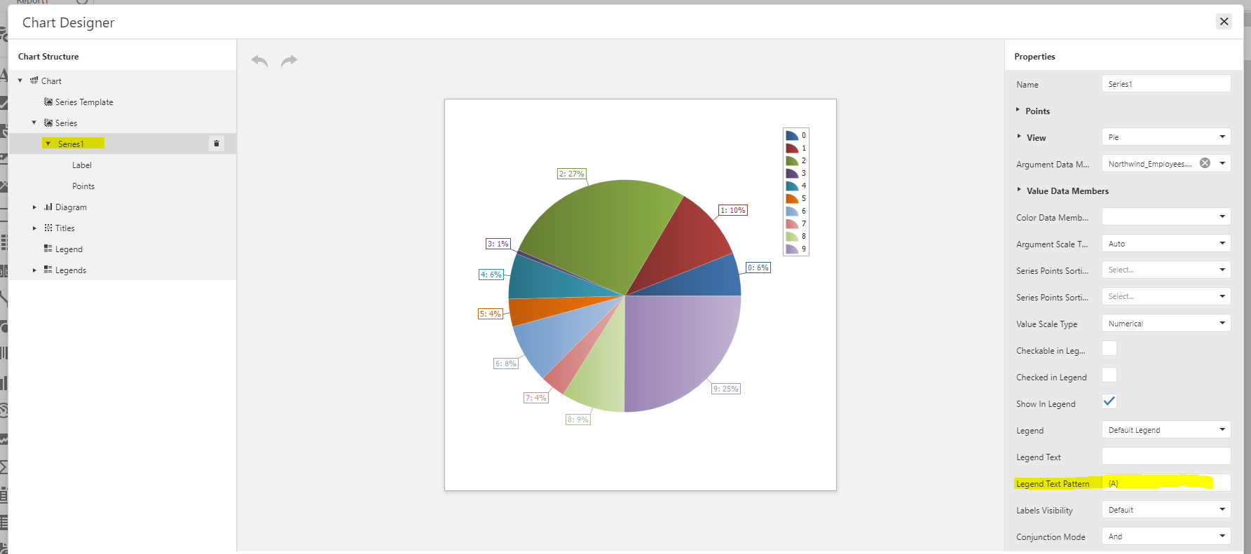
These “Text Patterns” are a bit of magic, but they are documented by DevExpress (the 3rd party reporting engine we use).
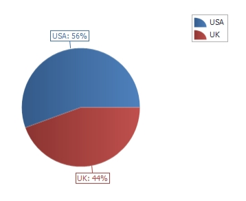
With my test data I was able to produce this:
Colors are tricky. You can select the predefined color palette to use from the Chart properties panel.
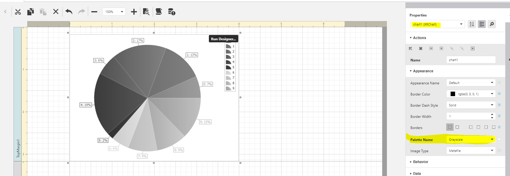
To explicitly control the color of each value the color must be defined by a field value in the data.

I was able to explicitly define by own colors in a calculated field like this (but it doesn’t scale well if there are lots of values):
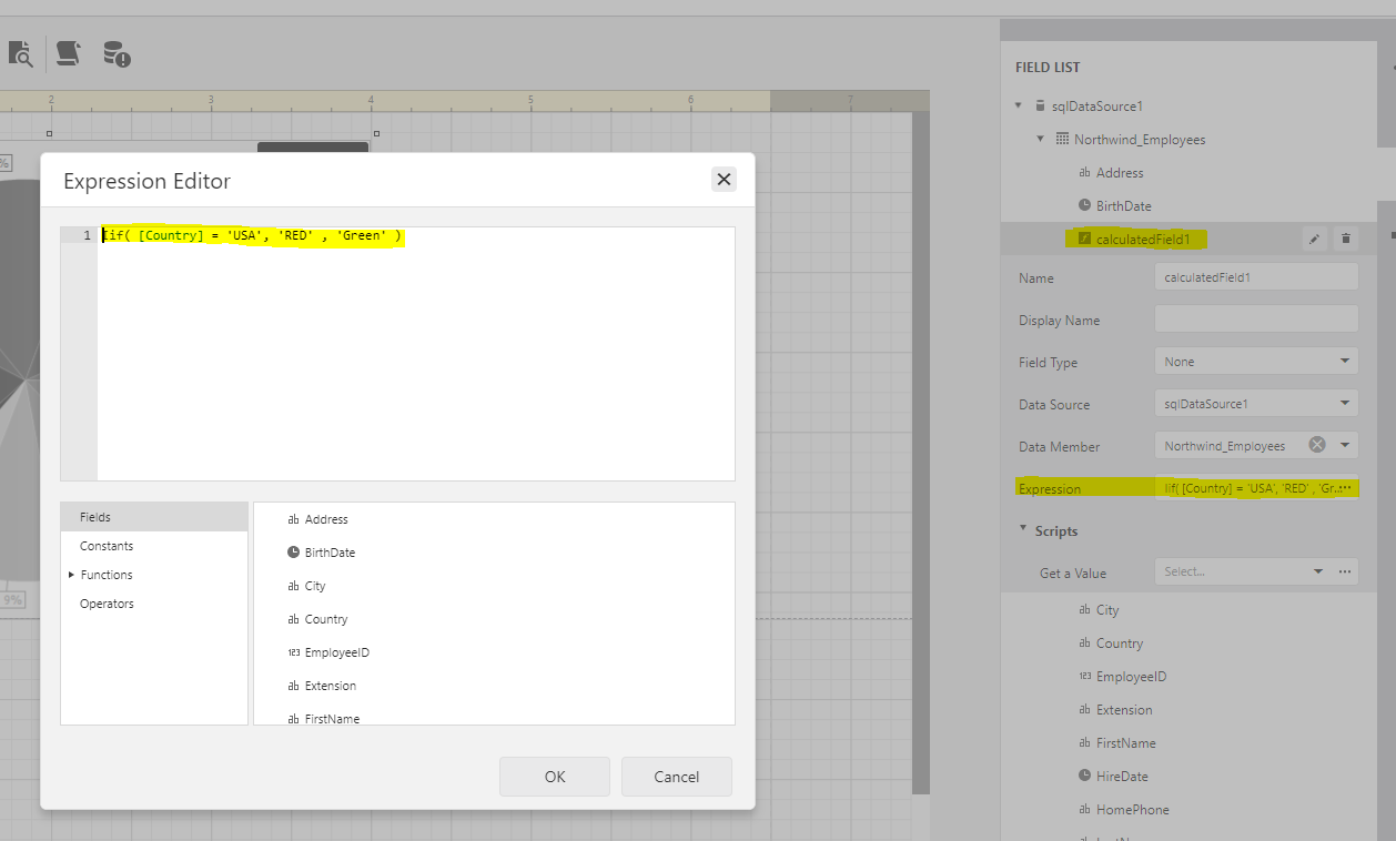
The color data argument does also accept hex color codes as input
0
Vous devez vous connecter pour laisser un commentaire.
Commentaires
1 commentaire