VS Web - Viewer is not responsive to browser size
Répondu
We are having a lot of issues with VSWeb regarding browser window re-sizing. Users have different experiences depending on how big their window is. Asking users to remove their bookmarks bar, for example, is not a viable work around in order to see the top of the banner. Essentials was really dialed in with flexibility in a lot of different ways that Web is really really really lacking. We also don't want to have to build a new graphic every time we want to have a new viewer for a project. Essentials lets you just type in a name and it shows up on a banner. We need just more stability in general with VSWeb, but this is just one issue.
-
Commentaire officiel

There is a big shift in thinking required to build an app in VSW vs GVH.
In GVH you had a bunch of configuration options, and a mobile/tablet/desktop 'skin' that were mostly automated; but you had no control over where anything was presented in the app. Dozens and dozens of folks gave us feedback that they wanted more control over the layout, and that is what we did with VSW.
Need to tweak one of the default templates, and have one that become your new corporate template you start building apps from? No problem, you can do that.
Need to add to your template a text banner that can be easily configured with different text for each app (just like in GVH)? No problem, you can do that by adding a text component into your layout.
Need to have both a mobile and a desktop layout that automatically load based on the screen size of the device viewing it? No problem, you can do that by having two layouts and some logic tied to one of the built in events to check the size and switch the layout, just like you had in GVH.
Need to re-brand an app to a completely different color including all icons, buttons and accents? You can do that, by choosing a single branding color for the app and it adapts. This was often requested in GVH, but required generation of custom icon sets.
Is it done using the same mechanisms as GVH? No. Can you achieve the same (or better) control over what your app looks like for an end user in VSW? Yes.
p.s. If no one on your team has taken the VertiGIS Studio Web training course yet that would be a great place to start.
-
Thanks for the info Cam! This all sounds promising and maybe with a few pointers and training, we'll be up to speed.
0 -

Hi Cam Barnard. I've done the web training course and it didnt cover doing multiple layouts nor how you would trigger which one to load. I've created a workflow to do it and run it off the map initialise event but I don't think I am doing it the best way. Is there a blog article or examples for the best way to do this and what event to run the workflow or better still can this be a setting we apply to each layout?
Belinda
0 -
I took the training as well, and did not learn this sort of thing either. The instructor would not have know either had I asked. Any thoughts here Cam on how to proceed?
0 -
Belinda Kerr Ryan Kelley Good morning! Here is a sample I created when I was figuring it out for myself.
In my example I'm using the Services > App > Application Initializing event to call a workflow
The workflow uses the viewer.get-capabilities VSW command to get a snapshot of the app environment https://developers.geocortex.com/docs/web/api-commands-operations-events#operation-viewer.get-capabilities https://developers.geocortex.com/docs/web/api-commands-operations-events#definition-ViewerCapabilities
I am looking at screen width, but there is more you can look at.
The Workflow then makes a decision and calls viewer.load-layout to pick an appropriate layout.
https://developers.geocortex.com/docs/web/api-commands-operations-events#command-viewer.load-layout
To test this, create a blank app (save it) and upload the app and save it. Launch that app, and make your browser window smaller or larger ... hit F5 to re-load the app when the browser window is small and it will load the mobile layout, re-load the app when the browser window is large and it will load the desktop layout.
By default the app will reference a public Workflow that I've created, but I've also supplied that Workflow json so you can examine and modify it.
With this functional example you can begin experimenting further.
I just tested this all in 5.17 to make sure it will work for you.
https://data.latitudegeo.com/Cam/Desktop-and-Mobile-Layout-App.zip
https://data.latitudegeo.com/Cam/Layout-Chooser-workflow-export.zipHave fun!
Cam
2 -
Cam Barnard Thank you! I had pretty much the same steps with some added ones of changing the ui density for each layout but was running the workflow on the wrong event. At least I was on the right track :)
Any chance we can get settings in the designer for each layout that allow it to automatically swap based on user set screen width etc? Would also be interested in a nicer way of getting the layout name or being able to use the label for the layout in the workflow.
Belinda
0 -
Belinda Kerr ... great work.
"Would also be interested in a nicer way of getting the layout name or being able to use the label for the layout in the workflow" We noted this as well. Just finished testing two new commands (now in our master code base) that will be available in 5.18 that let you get the list of layouts configured, and to get the current layout in the app.
viewer.get-current-layoutandviewer.get-all-layoutsYou might have noted in my example I went into the app.json and layout.xml and modified the layout IDs from the generated GUIDs to something more comprehensible. This is allowed, but we haven't given you a mechanism for doing it in Designer yet.
"Any chance we can get settings in the designer for each layout that allow it to automatically swap based on user set screen width etc?"
We've explored it a little in the past, we might get there eventually.0 -

Hi Cam,
Thanks for sharing the application and the workflow. This works as a charm!
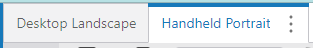
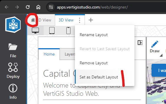
Is there a way to configure the default layout that is loaded in Web Designer? Now it loads the Handheld Portrait by default when launching the application in Web Designer:
Do you know what needs to configured in the workflow to load the Desktop Landschap layout by default in Web Designer?
Marina
0 -
Hi Marina - in newer versions of Web (since around 5.23) there is a specific function in Designer to set, and show which is the default layout.
 0
0 -
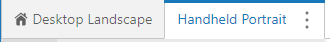
Hi Cam, thanks! I didn't know about that. However, this didn't work for the example application and workflow you provided. I set the desktop layout as the default layout as described in your screenshot but when reloading the application in Web Designer it opens with the mobile layout again.
Do you have any other suggestions to get this resolved?
Cheers,
Marina
0
Vous devez vous connecter pour laisser un commentaire.
Commentaires
10 commentaires