Add a graphic that is not just a blue dot in workflow

I am working with expanding the Multi Layer Report with Map code sample. Instead of schools, I am having it display fire hydrants within 800 ft of a point location. With the sample, the found hydrants show up as just the basic blue dots with the "AddMarkup" command.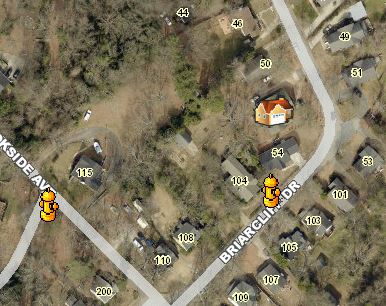
Would someone please steer me in the right direction of how I could display nice fire hydrant graphics in either the HTML Viewer or SLV? Kind of like the ones below that I am using in an FLEX app (non-GC app)? Or if the icons are not possible, how can you at least change the dots from blue to red for just this layer in the report?
Thanks,
Carmen
0
-
Srikanth,
Thank you! This has proven extremely helpful to me. It would have taken me forever to determine the renderer input.
Setting the offsets were very interesting. I am pushing the map to a report. The Offsets in the HTML Viewer appeared differently from what was exported to the report (created in a workflow).
The first image below shows how "off" the graphics were from the true location of the feature (blue dot) within the HTML Viewer. - Hydrants were all offset to the Southeast of true location.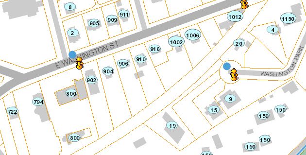
But when exported to the report, the offsets looked like this (offset more to the northeast)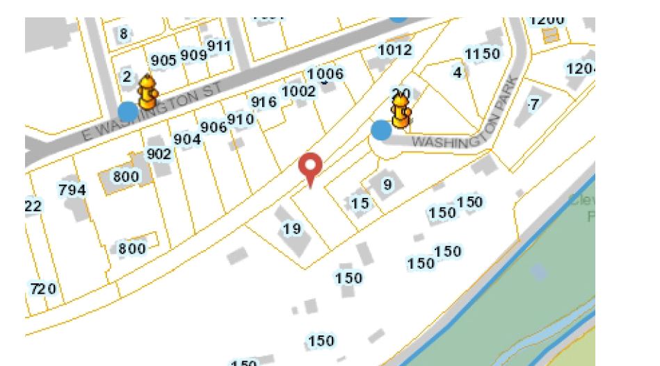
Did you notice this also?
Eventually, I found an offset that is acceptable in both the Viewer and the report - luckily the hydrant icon is large enough to hide the fact that it isn't exactly in the right location.
Thanks again,
Carmen0
Please sign in to leave a comment.
Comments
1 comment