Interface of geocortex occupies large area at the expense of the map,
Interface of geocortex occupies large area at the expense of the map,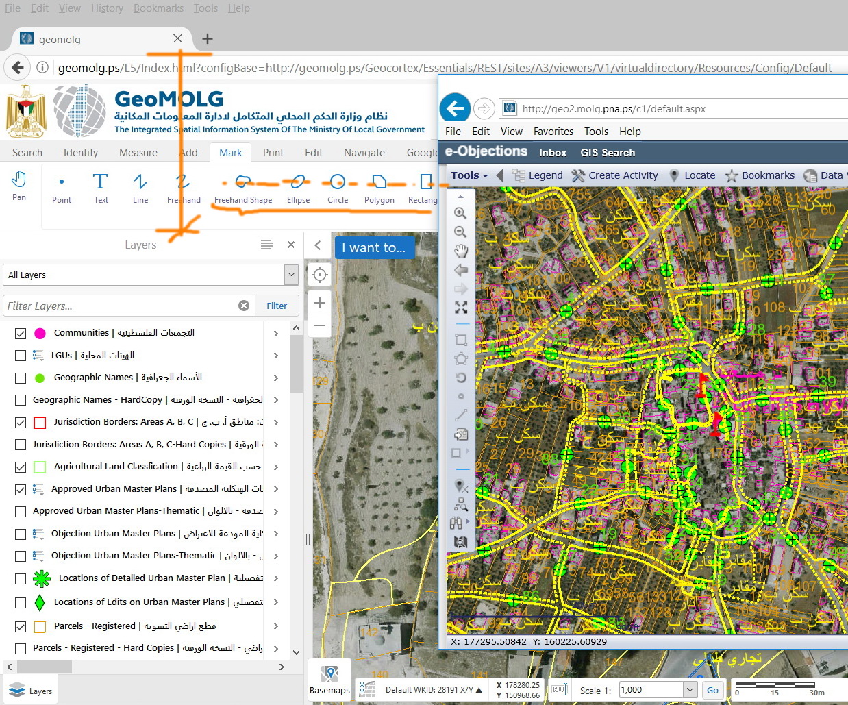
I observe that the interface of goecortex occupies the major part of the screen and thus the map area is not sufficient. My suggestion is just to redesign the icons to get them smaller. For example, there is no need to have the names of the tools written under each icon. They can just appear as tips. We can still have all the cons displayed but with less area occupied.
Do I need to post this as an idea or there is some workaround?
0
-

Hi Jamal,
Version 2.9 of the HTML5 viewer will include the requests you are asking about, smaller icons and optional text in the toolbar. Version 2.9 is being targeted for an early July release but the date has not been firmed up yet. This was mentioned in the most recent Road Ahead webinar at around the 10 minute mark.
Regards,
Wayne Richard
Latitude Geographics Group Ltd.
Head Office: 300 – 1117 Wharf Street Victoria, BC Canada V8W 1T7
Tel: (250) 381-8130 | Fax: (250) 381-8132 | wrichard@latitudegeo.com
Developers of Geocortex web-based mapping software | www.geocortex.com
An Esri Platinum Business Partner0 -
Thanks Wayne.
Even with GE 4.10.3, the space located for icons is still big (in comparison with Cityworks, for example).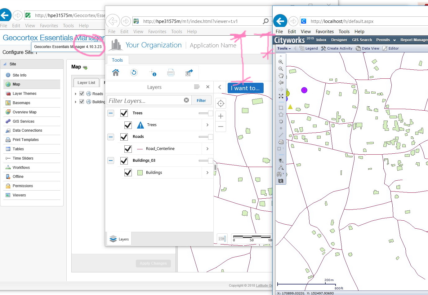 0
0
Please sign in to leave a comment.
Comments
2 comments