Make layer list (layerlist) more compact
Hi all, and apologies if this has been asked previously.
Is there a way of reducing the layer items in the layer list?
I'm in the process of replicating our GVH instance in VSW, and I'm finding some limitations around the look and feel of some things, including this. There just seems to be a lot of 'padding' around items such as layers in the layer list, and results, in the result details for example. I've been able to change the result settings to use the compact option by default, but is there a similar pattern to reduce the layer items, or even change that text to not say "Zoom in to View". The GVH based italic layer name was a good idea I thought?
Any tips/tricks appreciated
Gareth

-

The Inject CSS activity is pretty flexible, you should be able to reduce padding fairly easily with that. You can also use CSS and display:none; to hide that "Zoom in" text. Binding to the layer title will be slightly tougher but I bet you can use :has() for it. I'll add that while *I* liked the old italics idea I had a lot of users who didn't find it intuitive and are less confused by the new situation.
Text updates are trickier, if you're after that, but can be done by updating some VS Web files on your server (I know they're in there somewhere but I haven't toyed with them before myself) or in WF by accessing the app config through the Get Layout operation then drilling down into the app config and finding the bindings between all those app elements (getLayout.result.messages.appContext._application.ui.regionService._registry._registeredStrings).
0 -

Zack Robison
Thanks for the tips!
But, I'm a little unsure of what you're actually saying - sorry! Do you mean, use the Inject CSS activity in a workflow, and run that on startup? Is that what you're suggesting here? I'm new to the whole VSW/Workflow regime, and currently learning a lot!
Any examples would be truly appreciated.
cheers
Gareth
0 -

It would be nice if there were options built in to customize this so we don't have to hack at it with CSS
3 -
Agree totally. I've been able to get a better looking UI, but yeah, using CSS to do this is hardly acceptable.
0 -

I'm struggling with the look of the layer list as well. Gareth, you said you got a better looking UI. How did you do that? Did you find a way to reduce the white space? I'm getting complaints from my users that are doing testing for me.
0 -
Hi Jess,
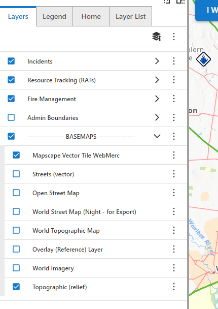
I've only been mucking around with just trying to find the right css items to change. Some seem to be ‘generic’ so should across multiple apps, and I've attached the workflow options for these here.
Basically you create a workflow, using the Inject CSS activity

Load in the CSS to change. My specific items are below.. some generic, some could be unique to the application - I'm yet to go beyond this. But hopefully the concepts still hold true in your case.
/* reduce padding between layers in layerlist */
.gcx-layer-tree-node {
padding-top: 0px;
padding-bottom: 0px;
padding-left: 5px;
padding-right: 5px;
}
/* reduce padding between checkbox and layers in layerlist */
.layer-tree-item-icon-container {
margin-right: -20px;
}/* remove secondary zoom in to view or etc layer of text for each layer in layerlist */
.gxw-ltr-1s25qzt {
font-size: 0rem;
}/* Horizontal line above map and left panel */
.gxw-ltr-rrbek8 {
border-top: 2px solid rgb(161, 161, 161);
}/* shrink the text in the layerlist */
.gcx-layer-tree-node-title {
font-size: 1.2rem;
}/*shrink the check box and text in layer list */
.gxw-ltr-xhhn1n {
font-size: 1.8rem;
}/*put grey line divider between layers in layer list - similar to GVH */
.gcx-draggable-list-item-container.MuiBox-root.gxw-ltr-0 {
border-top: 1px solid #dddddd;
}
/*put grey line at bottom of layer list */
.gcx-layer-tree {
border-bottom: 1px solid #dddddd;
}/* shrink the blue button for the expand folder in layer list */
.gcx-layer-tree-node-expand-button {
padding: 2px;
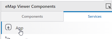
}And then in VSW designer, hit the Services tab → App
Under Events -→ Application Initializing, search for the workflow you have created, and this will override the default CSS as loaded

end result - and certainly not final - but at least a bit closer to the old GVH version
 0
0 -
a guess a word of warning on this approach though - I think it more or less takes out the option to use VertiGIS' own compact option, as you need to load this up the same way also - and we're using up this on load option with the css workflow.
0 -

Hello Gareth, can you post a screenshot of the result? Thanks in advance.
0 -
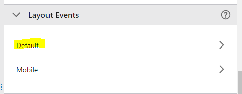
Thanks Gareth. I think I found a solution. The reason I wasn't using the Application Initializing event in the App config like Cam recommends is that I already have the Swap Layout events configured there. That makes the app open in Mobile layout if the device screen size is smaller than 900px. Very handy!
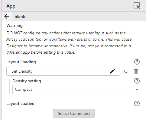
But if you scroll down a bit in the App config section and open the Default Layout Event, you can set the Layout Loading event to Set Density. So far in my testing this seems to work.
This Compact Density setting is better than Default, but I do still wish we could control the appearance more. A bigger indent for items nested under a parent layer group would be nice, and even a different color for the parent layers to make them stand out from the child layers would help. I think I'll submit that as an idea.
 0
0
Bitte melden Sie sich an, um einen Kommentar zu hinterlassen.
Kommentare
9 Kommentare