Best Practices - swap layout based on screen size
Hello, I'm working on a new public geocortex web app and I'm really wanting to get the mobile experience dialed in. I was wondering what the current best practice is for us user having a single url in which the app loads an appropriate layout (desktop/tablet/mobile defined in designer) based on screen size.
I am planning on running a workflow on map view changed event and setting viewer.load-layout based on viewer.get-capabilities. I see that view.get-capabilities gives me:
- aspectRatio: 1.0856102003642987
- height: 1098
- orientation: "landscape"
- supportsHover: true
- supportsPointer: true
- supportsTouch: false
- width: 1192
so maybe if it's landscape load desktop and if it's portrait (height < 800 ) load mobile? I'm planning on experimenting - just wondering if anyone had all the gotchas worked out.
-Jake
-

Hi Jake - you've got the right idea. Here is a starting point for you.
This is an app with both a desktop and mobile layout, that uses a workflow to switch automatically. The workflow is public, but I've also linked it here so you can import and look at it.
https://data.latitudegeo.com/Cam/Desktop-and-Mobile-Layout-App.zip
https://data.latitudegeo.com/Cam/Layout-Chooser-workflow-export.zip
I chose the App (Service) > Application Initializing event (rather than map view changed) as it is very efficient to check this on startup (before everything is loaded) and then load the right layout. The downside is once the app is loaded it isn't going to detect changes in screen size/orientation.
You will also discover that in my workflow I'm really only looking at one aspect which is screen width to make my decision.
If you import the app into a new blank template and save it. You can easily test this by changing the size of your browser tab/window and re-loading it to see how it works.
Cam
0 -

Agreed on just using screen width, I'm using 992.
I ended up using the change event for map view but added a get/set application detail (desktop/mobile) - so the layout only switches if its different from a resize.
Seems like I can pass in mobile and desktop layout ids (example: item://layout/Mobile-a0e4bf1f-ded9-41a5-911c-8cacf436c793) to the workflow and just re-use it on all my apps.
here it is in action
0 -

Thank you for this, it's exactly what I needed!
One follow up question though, how did you get your layouts to have 'normal' names? In VertiGIS Studio my layouts are "Mobile" and "Desktop" but their IDs are "blank" and "Mobile-a02ee4c2-3c91-4a66-a1ef-ceaac1cd8efa". It's not the end of the world as I can just update the workflow accordingly but I will eventually need to replicate this in other apps and would like to be able to re-use the workflow.
Thanks,
-Chad
0 -
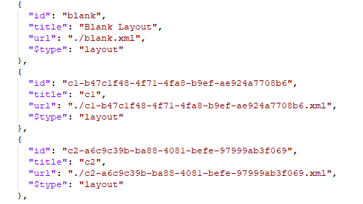
Chad Bergeson Yes. Usually we let Designer generate IDs and for the most part you don't have to interact with them. If you want to manually update layout IDs for simplicity as we have done in our templates there are only a couple of things you need to change. To illustrate I took the Blank template and created a new app and added two more layouts to it c1 and c2.
Inside the app.json you'd see something like this (likely they won't all be together in the app.json):
Two stich to simpler layout IDs ... the changes you need to make are in three places. 1) The ID in the JSON above. 2) The URL in the JSON above 3) the filename of the XML layout file.
for example:

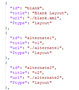
As you might note from my example, these changes are independent of the 'title' shown for the layout in Designer which I've left as c1 and c2 to illustrate.
1 -

Using the properties being returned from view.get-capabilities (i.e. width, supportsTouch ,etc.), how is everyone defining which layout should be applied between various devices: desktops, tablets, smartphones? I suspect others must have put some thought into this already , and I rather not re-invent the wheel.
Overall, I'm trying to figure out what the if-else / switch logic should be.
0 -
Mike Diss-Torrance ... from what I've seen so far most folks including me are using either screen width or screen height.
If you download the Layout-Chooser-workflow-export.zip above it will show you a sample of what I did around screen width ... my conditional was:
=$client.result.width <= 1024
0 -
I assume you are not distinguishing between desktop vs tablet vs mobile. In other words, ignoring 3D, would you only have 2 layouts in your solution that can be automatically swapped?
I'm thinking back to Geocortex Essentials and trying to figure out what criteria it used between desktop vs tablet vs mobile. Other than whatever values were used for the width and height, was it based on anything else (i.e. touch screen vs. pointer)?
BTW.. My progress on all this was directly tied to your Layout-Chooser-workflow-export example. It's very much appreciated that you shared this. Keep it up!
0 -
I'm brainstorming an idea, and wouldn't mind getting a second option...
Rather than using just width or height for the logic that determines whether to use a desktop, tablet, or handheld layout, perhaps use the sum of those values. That addresses the situation when the tablet or phone is turned 90 degrees and width/ height alternate. The sum of the values will always be the same. For desktops, it will likely be a value greater than 1790, handhelds a value less than 1150, and tablets between both those ranges.
I got those values based on figuring out what the smallest desktop and the largest phone could be.
Does this make sense and/or does anyone have a different opinion?
Cheers,
Mike
0 -

Cam Barnard Thanks for all the info, it's really helpful. When using your layout chooser workflow, I noticed the Set Desktop command prevented my launch link workflow from running. When I unhooked it, so it would only set mobile if needed, the launch link workflow works fine. Do you have more background info on how the application initializing step + changing layout interferes with launch link workflows?
0 -
Chelsea Rozek ... hmmm interesting. I'll have to dig into that and see what I can find out for you.
0 -

Hey Chelsea Rozek echoing Cam's comment that's interesting. I'm wondering if this is a timing condition based on the workflow running during the application initialization. For testing purposes, if you move it to the Application Initialized event (rather than initializing) do you see the same unexpected behaviour of the Set Desktop not working? That could tell us more about that specific issue.
0 -
Cam Barnard, @... Thanks for the quick reply. I gave that a try: Application Initializing = nothing, Application Initialized = Layout-Chooser workflow. Used launch link workflow to launch app = Works! As expected with moving it later in the loading steps, if on a mobile device it flashes the desktop version before redrawing it as the mobile version, so I may go back to just unhooking the Set Desktop and leaving it on Application Initializing.
0 -
Hey Chelsea Rozek thanks for giving that a shot - confirms the suspicion there's something not quite ready for that launch link workflow to behave as expected with the layout-chooser workflow in the initializing context. Having this detail should hopefully inform us on the product side that there may be some code changes we could make to ensure you can get your desired behaviour. I'm not entirely clear why these two things relate but I'll leave it to smarter minds than mine.
I can imagine you wouldn't want that weird post-load layout change so yes, makes sense to fall back to your unhooked workaround for now.0 -
Chelsea Rozek Had a note to dig into this and finally had a chance today. I can confirm that somehow the viewer.load-layout command behind the scenes when used in the application initializing event is indeed blocking the launch link workflow from firing.
I eventually got this down to some simple repro steps and filed it as a bug. #259154 if you want to keep track of it.
0 -
Cam Barnard Thanks for the update! I'm not seeing that # in the changelog, do you know if there's an upcoming fix? We're hoping we can run launch links on mobile layouts.
1 -

In version 5.33 Bug Fixes - Launch link workflows now execute correctly alongside viewer.load-layout during app initialization. [259154]
0 -

Does anyone have a sample workflow that they can share to automatically detect the user's device type and switch to mobile or desktop layout based on that? While the app is loading; I am trying to create a workflow that does that and then set the map zoom scale based on device screen size
Much appreciated, Nel
0 -
Hi Nel - I posted a sample app and workflow above.
https://support.vertigis.com/hc/en-us/community/posts/11497610177170/comments/11497617013010
0 -
Hi Cam,
Thank you for your reply.
Have there been any changes since that posting? Dan's comment about the bug fixes got me thinking there may be changes needed to adapt to the app updates
0 -
I am getting this error: AppConfigError: The following error occurred while retrieving item "desktop-landscape" of type "layout" from an App: No item of type layout is defined with ID 'desktop-landscape'.
0 -

I think your layouts have different IDs.
0 -
I am a new user to VSW - can someone please provide step-by-step instructions how to implement this workflow in my testing app correctly? How do I obtain the IDs of my layouts? Where do I input those IDs?
0 -
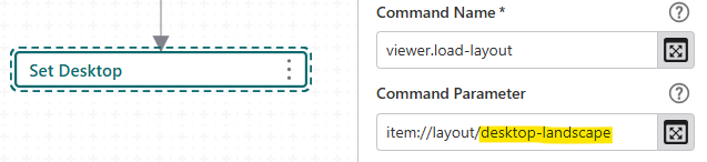
Easiest way to get the layout ID: the name of the xml file in the zip if you export your app from the designer.
You can find the layout ID here in the worfklow.
 0
0 -
Here is another simple example I whipped up: https://uadnrmaps.wi.gov/demo/Layout_Switcher.zip. Within it, it uses a button to swap between 2 layouts. The first layout uses the default ID of “blank”, but when I created a new layout, its default ID is a bit more involved: “Layout2-8575a3bd-80d5-462b-ae36-3af877700456”.
The button in each layout calls the same workflow, passing in the opposite ID. The workflow then reads in that ID and runs the viewer.load-layout command (see Nino's screenshot)
I also added some code (but commented out) that uses the user agent to determine if the web browser is from a mobile device or not. You could use that instead of a button, but you'd need to run that from the “Application Initializing” event within the APP section. This approach is what we have applied to this application: https://dnrmaps.wi.gov/H5/?viewer=POC
0
Bitte melden Sie sich an, um einen Kommentar zu hinterlassen.
Kommentare
24 Kommentare